
Ginger Cafe
Working with stakeholders to better advance user experience for their mobile & web sites.
For our customers
Ginger Cafe is renown Vietnamese-Thai Fusion restaurant that aspires to keep up with modern times and advancing their user flow and experience for their customers. A team of 3 works together with stakeholders to mockup a redesign of their website and mobile site could be in order to achieve what our stakeholders envisions and to fulfill their users desire.

Overview
Team
3 freelance UX designers coming together to problem solve a redesign project
Roles
- User research, analysis, & definition
- Visual design & development
- Prototyping & project management
Tools
- Figma
- Figjam
- Storyboard

(Original Ginger Cafe Website Homepage)
Through User Research we focused on...
1) Stakeholder's interview and user experience with their own website & mobile site
2) Usability and flow of the restaurant's web & mobile site as a user
3) The web & mobile site's heuristic evaluation to bring a fresh new image to the brand
Interview Takeaways:
-
Many interviewees had difficulty navigating through the navigation bar and different menus
-
The layout of the overall web & mobile site was overwhelming
-
Users were confused about the multiple menu options with duplicate items/how menu was organized
-
Stakeholders and users thought the color palette was distracting and hard to look at as they browse
-
The restaurant name/logo did not leave a strong impression, which relates to the brand's identity
-
Users believe the same information was redundant in all page access, which users and stakeholders deem as unnecessary
-
Users were confused as to why restaurant and website does not have an "Order" or "Take Out" delivery option, limiting ordering options to be in person or dine-in only
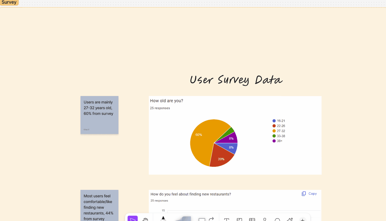
Our team conducted about 25 user surveys through outlets such as discord, email, and in-person that helped us with our stakeholder's website user flow, usability of the overall site, and general questions that relates to restaurant websites and mobile apps. Here you see are overall collective data & data analysis from the surveys.

With the information we collected through user interviews, stakeholder interviews, & user survey, we created an affinity diagram in order to visually layout our user's pain points, likes/dislikes, wishes, and the likes to better narrow down what's best for our user and their needs.
Competitor Analysis involves direct & indirect competition such as Quang Restaurant, China Wok, & Wild Fire


In order to draw ideas in user flow, accessibility, and visuals for our web & mobile sites, we did some user evaluation on competitors within the industry. Some are direct competitors, as in they are within the same category and others are indirect competitors, as in the same business only.

We then broke out affinity diagram and worked on the user flow layout in order to create the user flow chart from the data we have collected. With the layout we have the below user flow chart.


Here is the storyboard representing a user wanting to find a new restaurant and how Ginger Cafe's redesigned website and mobile site will help the new user with it's easy website flow and usability.
Ginger Cafe's Original Website Heuristics Analysis:
And with the original purpose and goal of this project, it was to create mockups of what Ginger Cafe's website would look like redesigned. In order to really make a change to the user flow, website usability, and aesthetics of the website, we conducted a heuristic analysis on the original website in order to better understand how to proceed with this project.


Prototyping & Iterations
1) First round of web & mobile site wireframing
2) Reiterating overall visuals & usability of heuristics
3) Creating a whole different web prototype after reevaluating first prototype
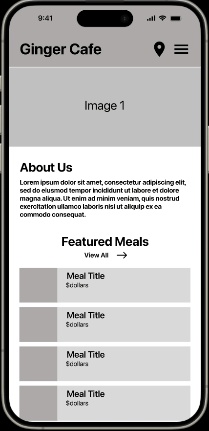
Checkout the beginning stages of prototyping, our low-fi prototype!
After our user research, we brainstormed individually as a team and came together to put our thoughts together. We came up with multiple mockups and layouts of what we think would help our users within this app using the research we have done. Below was one of our main mockups we ended up revising for the final.
And guess what? We also did some A/B Testing!
Can you spot what we were testing?
After wireframing and ideating our low-fi prototype, we came across a decision-making obstacle, what format would our users like best and what would make most sense for our user's flow? In order to find a more definite answer, we conducted A/B user testing with our users to decide how we proceed with our product.
Mobile Iterations:
We updated our colors to make it easier to the user's eyes, especially with buttons as the green color blended in with the images and text too much. We updated button colors to red in order to make them more visible and user friendly. We also updated drop down menus to highlight red in order to indicate users have open the drop down menu.


Website Iterations:
From our mid-fi to our high-fi, we improved the overall aesthetics/color and layout of all pages in order to totally revamp the website. With the original design we saw it was difficult to maintain user interest and flow so with some more research and style guide collection on visuals/colors/layout, we reiterated the overall design to be more captivating and to allow a more efficient user flow.
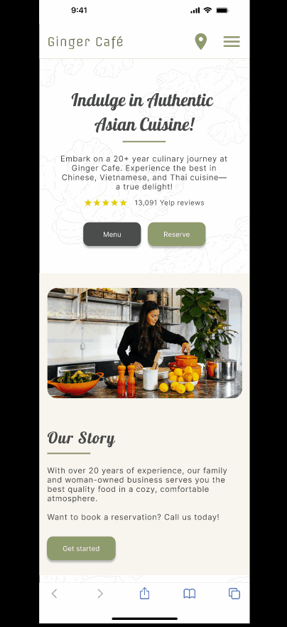
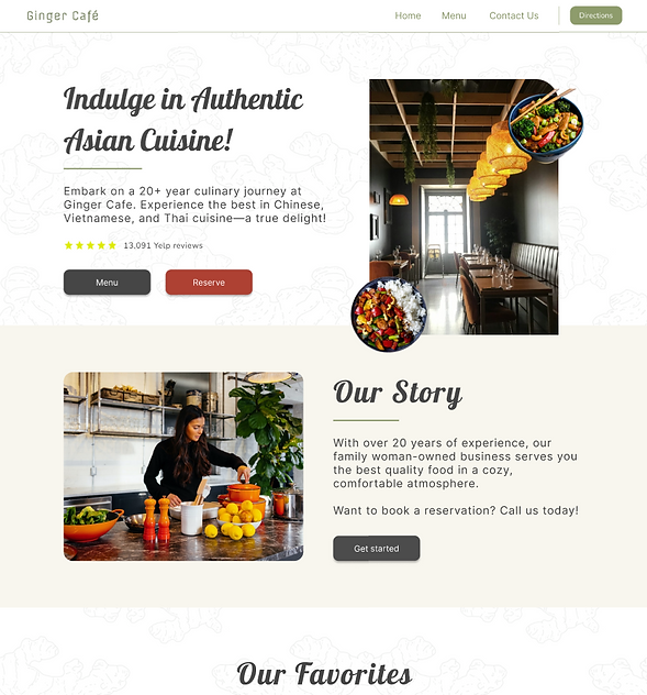
And the best for last, our final product high-fi prototype!
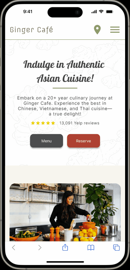
For Our Final Mobile Website Redesign:
We were super proud of making the mobile website redesign for Ginger Cafe and how it turned out. The mobile design now has easy access and user flow throughout the site with appealing visuals to maintain user retention.
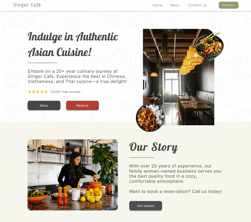
For Our Final Desktop Website Redesign:
Our users and stakeholders were content with the overall layout and aesthetics of the desktop redesign of the Ginger Cafe website. They especially loved the menu layout and believed and would contribute a lot to retaining users on the site and gain traction.
What we can do better. Feedback is always key. Our future suggestions & reflections.
After completing this project and its case study, our team got together and jot down suggestion ideas for future mockup, changes we'd want to see, and features we'd like to focus more on in the future.
01
Actually implement the redesign prototypes and make the website live for desktop & mobile versions.
02
Work more closely with stakeholders and have them test and see all processes throughout the redesign.
03
Explore more on features that we didn't get to expand on such as the "Order Now" takeout option & the "Directions" connecting to map apps.
04
Exploring ways on making items such as photos, icons, and menu interactive with actions to better retain usability from users.
